Improve cross-site admin navigation
Why we decided to iterate
Help admin users to quickly resolve issues
Design and development programme resource has been focused on delivering the service for the primary users of teachers (ECTs and NPQ applicants), induction tutors and providers.
DfE admin users support the primary service users by investigating data associated with participants, schools and suppliers. To better enable DfE admins to resolve issues, some updated design elements, improved usability and new functionality was needed.
What we did
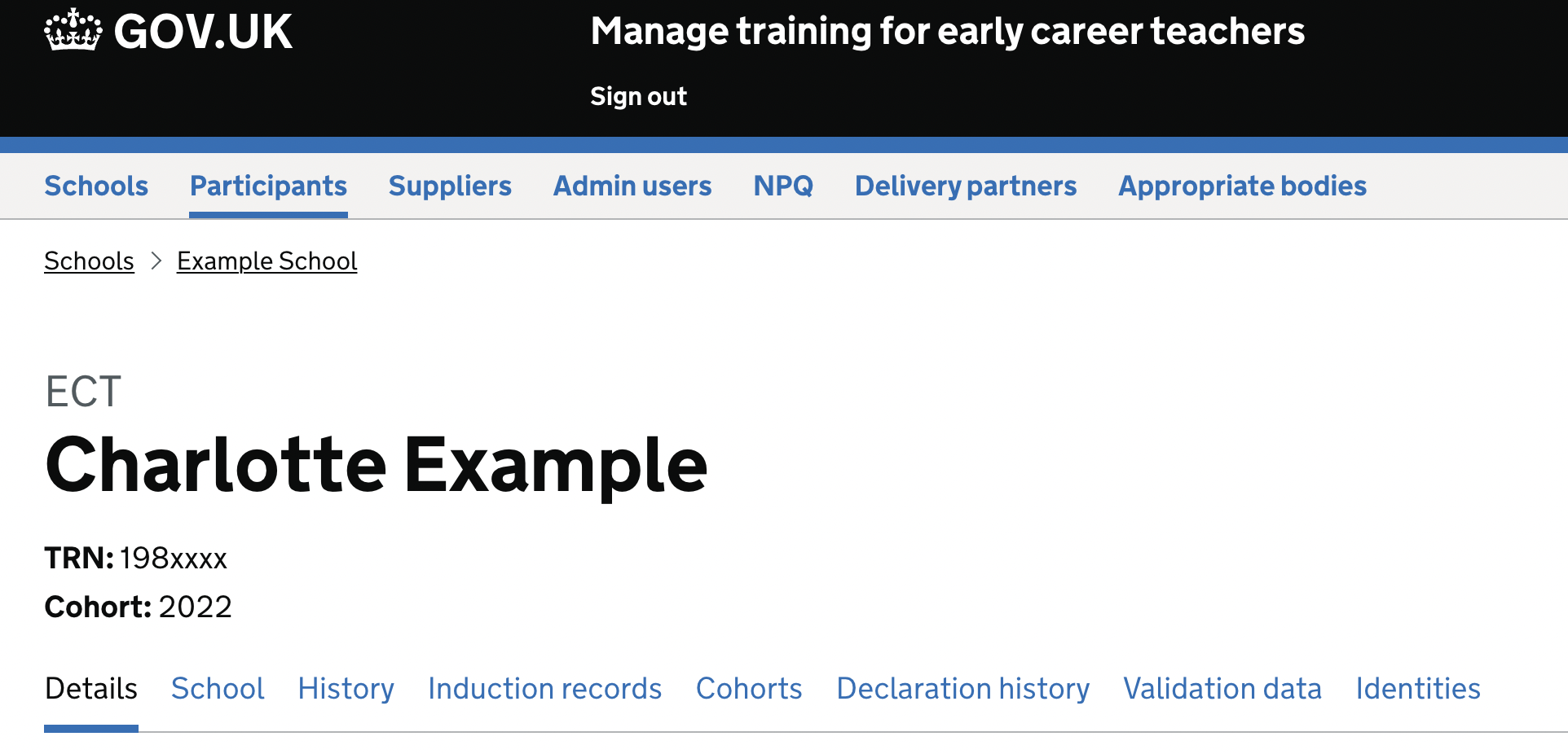
Replaced the ‘Back’ button with breadcrumbs
- The aim was to surface key info and allow admin users to journey through and across ‘Schools’ and ‘Participants’ site sections more easily.
- When searching a participant record, breadcrumbs will display, making it clear which school the given participant is registered to.

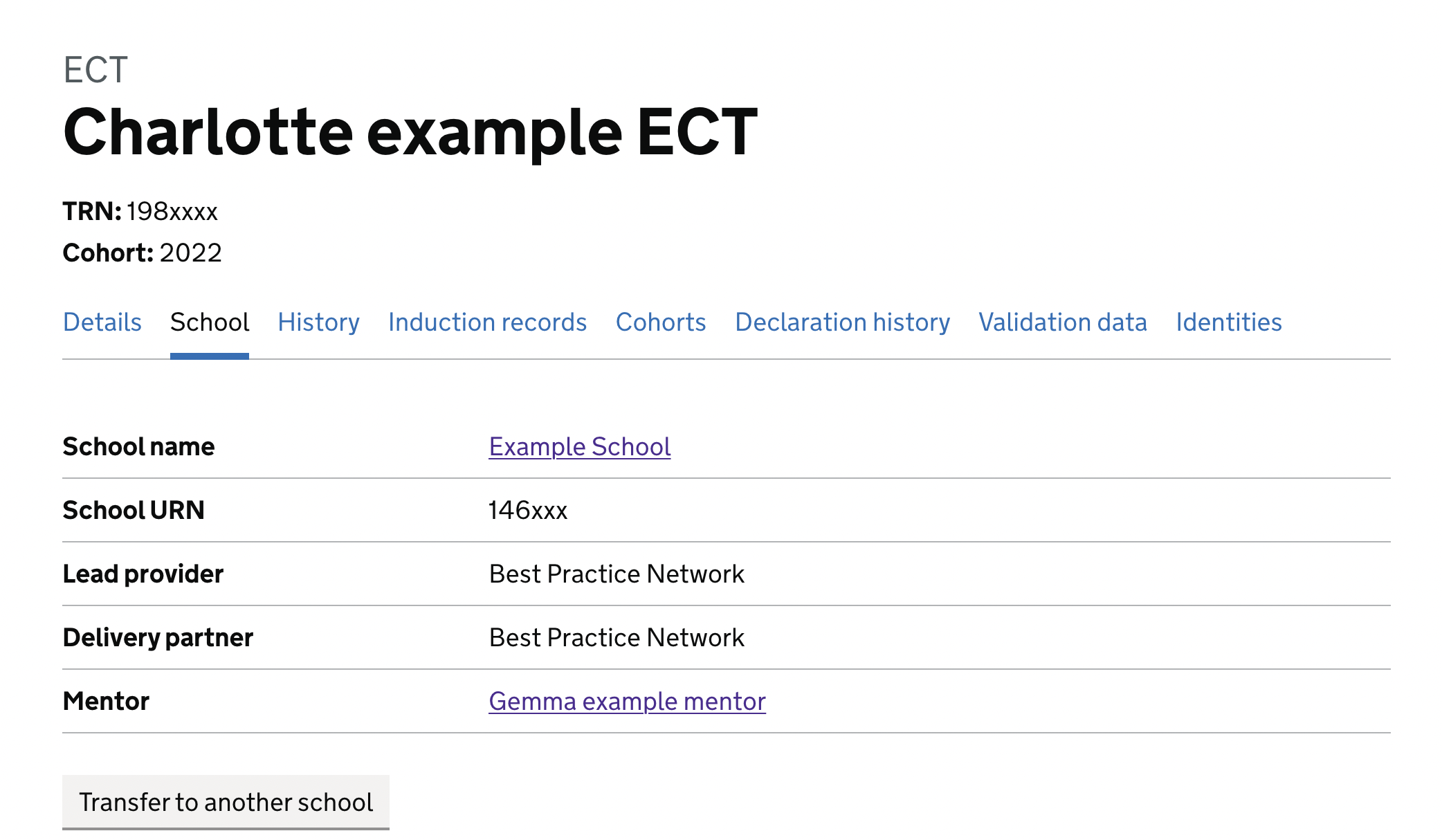
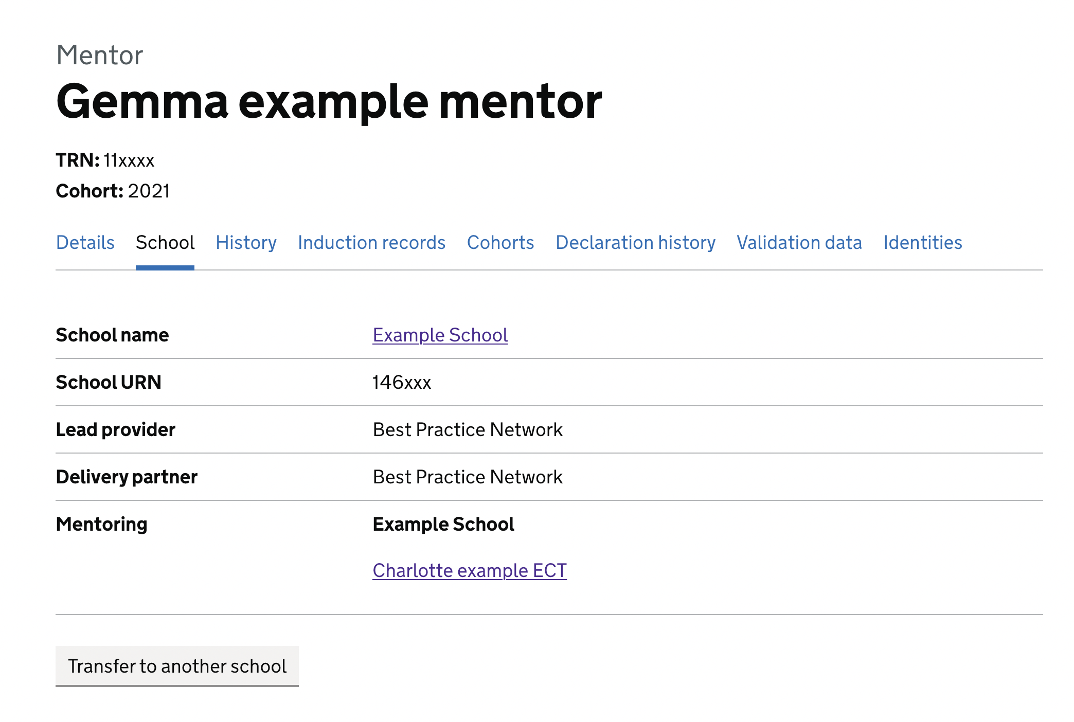
Linked ECT and mentor pages
- The aim was to let admins journey easily between participant pages without the need to perform multiple searches or investigation
- When on mentor pages, admin users are now able to see the list of ECTs who they are mentoring
- Both ECT and mentor pages now include hyperlinks to their associated mentor or ECT
- As there are cases where mentors work across multiple schools, the school name will appear as a header dividers within the new ‘Mentoring’ row


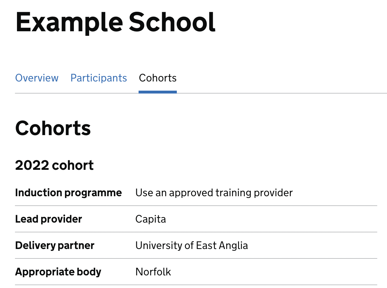
Appropriate bodies shown on school pages
- Previously, admins would have had to impersonate a school induction tutor to find the appropriate body. The aim was to reduce this unnecessary and inefficient journey
- Admin users will find an ‘Appropriate body’ row on the ‘Cohorts’ tab on a school’s page. Note - ABs are ‘optional’ fields so will often be empty

Next steps
The next iterations include adding appropriate body information to participant pages, improving the induction tutor impersonation journey, and adding search functionality to supplier pages.
Design team
- Hazel Yule - content design
- Kerry Baugh - user research
- Peter Yates and Laurent Curau - development