Mobile optimisation for financial statements

Why we decided to iterate

Issues affecting responsive display and accessibility

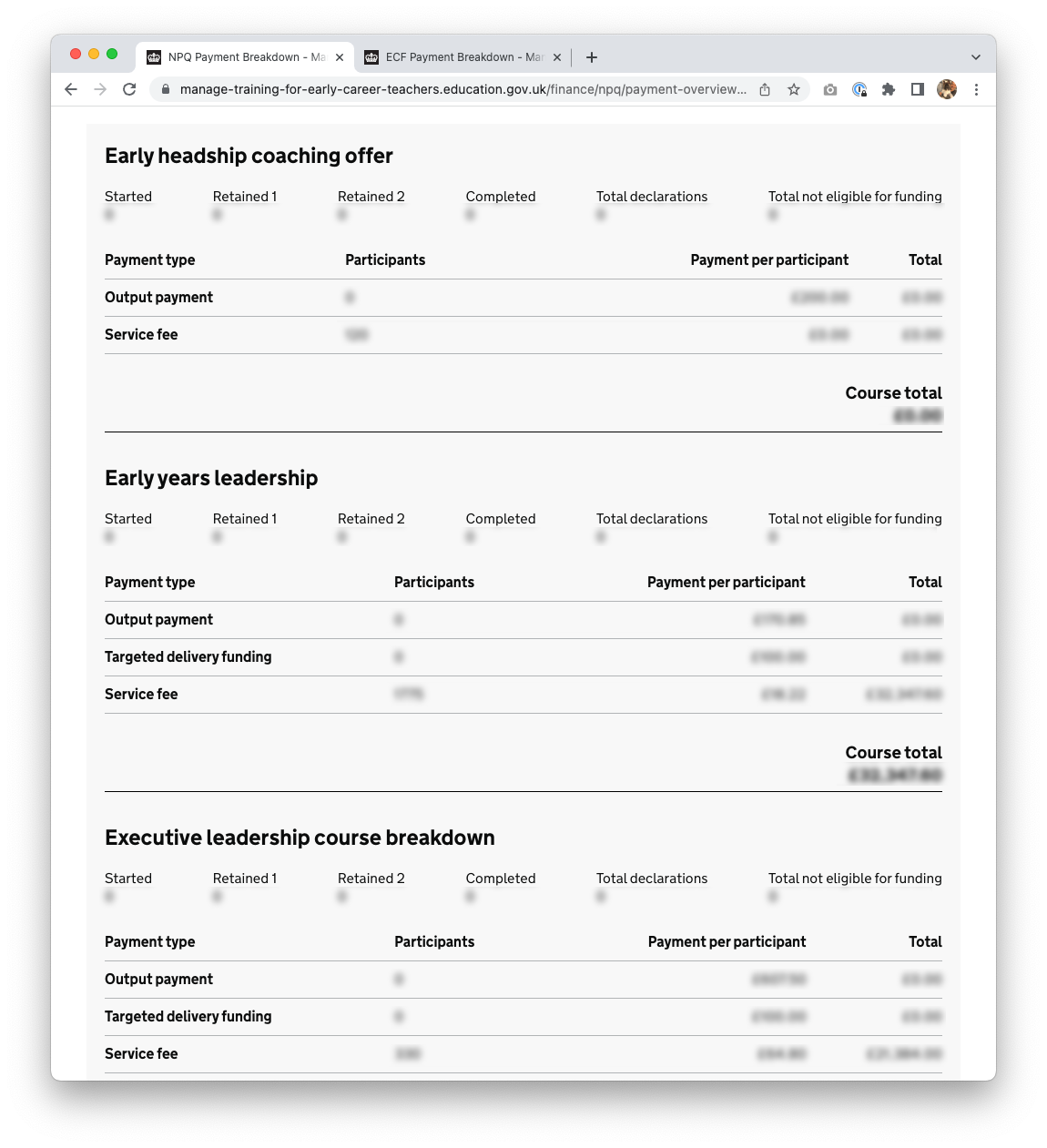
As part of ongoing reviews of interfaces designed for DfE contract management teams who support lead providers, a number of display issues were found on the ECF and NPQ financial statements.

When users sign in to the service to view financial statements on mobile devices, or smaller viewports, they were presented with a broken UI where content was either illegible or hidden.

Our aim was to fix these issues, so that all content is readily accessible across all devices and platforms, providing users with a mobile-friendly experience.

What we did

  1. We fixed the display issues by using Chrome’s dev tools to inspect the live service and write new HTML and CSS media queries.
  2. We updated the LPDOB service prototype to reflect the live service. This had, due to the pace of delivery, become out of date. This now allows our team a more efficient workflow between design and development.

What we learned

Improved ways of working

Some UI issues were still showing after the updated code had been published. This happened as the ways of working at the time excluded any official design review post deployment. Our team has since implemented post-dev design checks, which has proven successful and is one of the most valuable outcomes from this work.

The need for design histories

This work re-emphasised the importance of keeping design histories up-to-date. While we appreciate this should always be the case, we also understand that pace of delivery and staff turnover affects design history ownership. We want to ensure all significant design decisions are documented and, as new members of the team, we will be advocating for this going forward.

For example, during the review we noticed that the ECF and NPQ financial statements had been designed and built independently, each statement using different HTML and CSS code. As no design history had been documented on the rationale for this, it was not clear why there was inconsistency or why they were not designed to be mobile friendly.

Continued iteration

The overall designs of the current financial statements are still not ideal, both in terms of content and UI. A more holistic statement redesign including a number of improvements is on our road map for 2023.

Next steps

The UCD team will be redesigning the statements to allow for new functionality and standardisation across both ECF and NPQ. This will include the functionality for contract managers and finance teams to add adjustments and to view uplifts and clawbacks within monthly statements.

Issues that were fixed

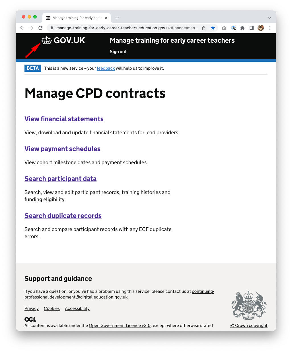
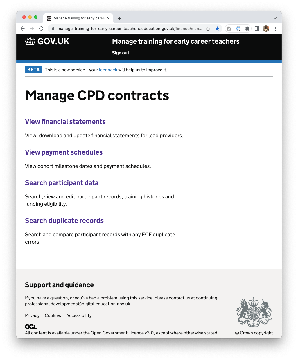
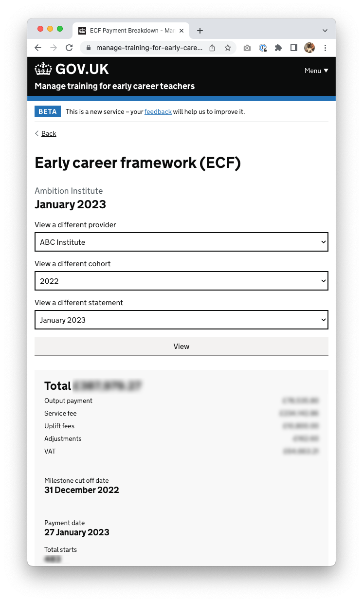
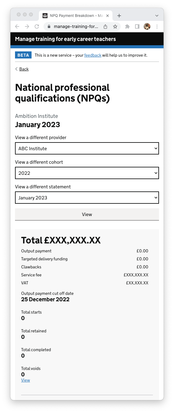
Below are screenshots of problems that were identified and fixed with CSS. Please note, all sensitive data has been anonymised.

Hidden content

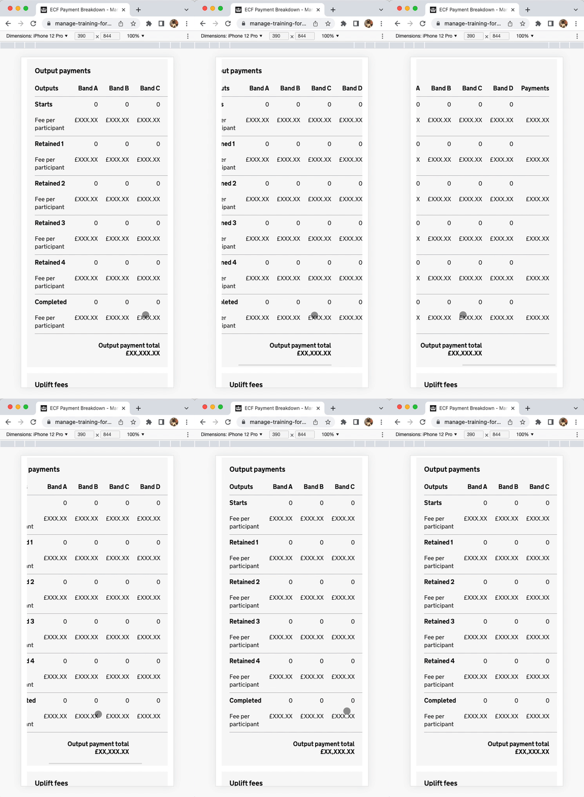
Missing CSS media query on container resulting in content being cropped and hidden when viewed on mobile devices.

Below: mobile view with dark grey box highlighting cropped content that is hidden outside the viewport.

The updated CSS enables horizontal scroll bars so all the content is viewable including on narrow viewports and mobile.
Zero margins

Incorrect CSS class on container with missing CSS media queries resulting in zero margin in mobile view. This affected all pages.

Below: margin applied on the container.

Misaligned header

Incorrect CSS class on header container with inconsistent CSS media queries resulting in misaligned content. This affected all pages.

Below: the header correctly aligned in any viewport size.

Inconsistent widths

Missing CSS class on one of the containers resulting in inconsistent select input widths.

Below: all select elements filling the full width of their container.

Incorrect layout (NPQ only)

Missing CSS media query on CSS Grid resulting in two columns (with one empty), instead of one column in mobile view.

Below: CSS media queries applied to change the two columns into one when viewed on mobile.

Squashed text (NPQ only)

Poor spacing on CSS Grid and Flexbox resulting in the appearance of squashed looking content.

Below: CSS media queries applied to add margin spacing between elements when viewed on mobile.

Incorrect text alignment

Numeric CSS classes missing from various table columns resulting in incorrectly left aligned content.

Below: CSS classes applied to columns containing numeric data resulting in right aligned content.

LPDOB design team

  • Hazel Yule - content design
  • Darren Courtney - interaction design
  • Kerry Baugh - user research