Registration details – updates
See this post for background on the initial design.
After a round of research and more in depth conversations with the development team, the following changes were made.
1. Funding status
The problem
- Users did not know what the different types of funding were.
- The registration page gave no explanation for the status.
I dont know what targeted or scholorship funded is? Terminology used to be ‘fully funded’ or ‘DfE funded’.
Design changes
The changes listed below were guided by an existing document, which outlines the different funding scenarios and shows the content used in each scenario (on outcome pages and in emails). The same or similar content was used to keep the service consistant and avoid confusion for users.
-
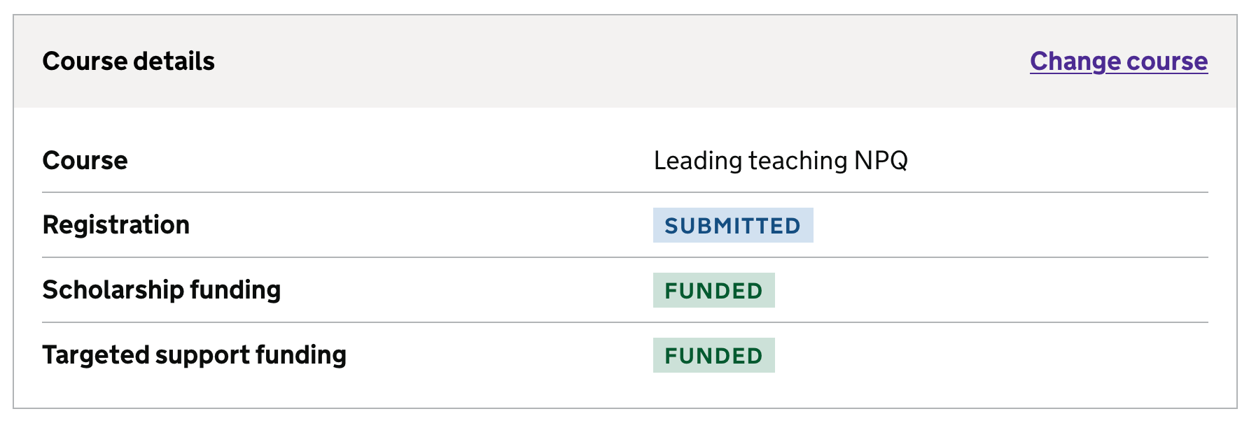
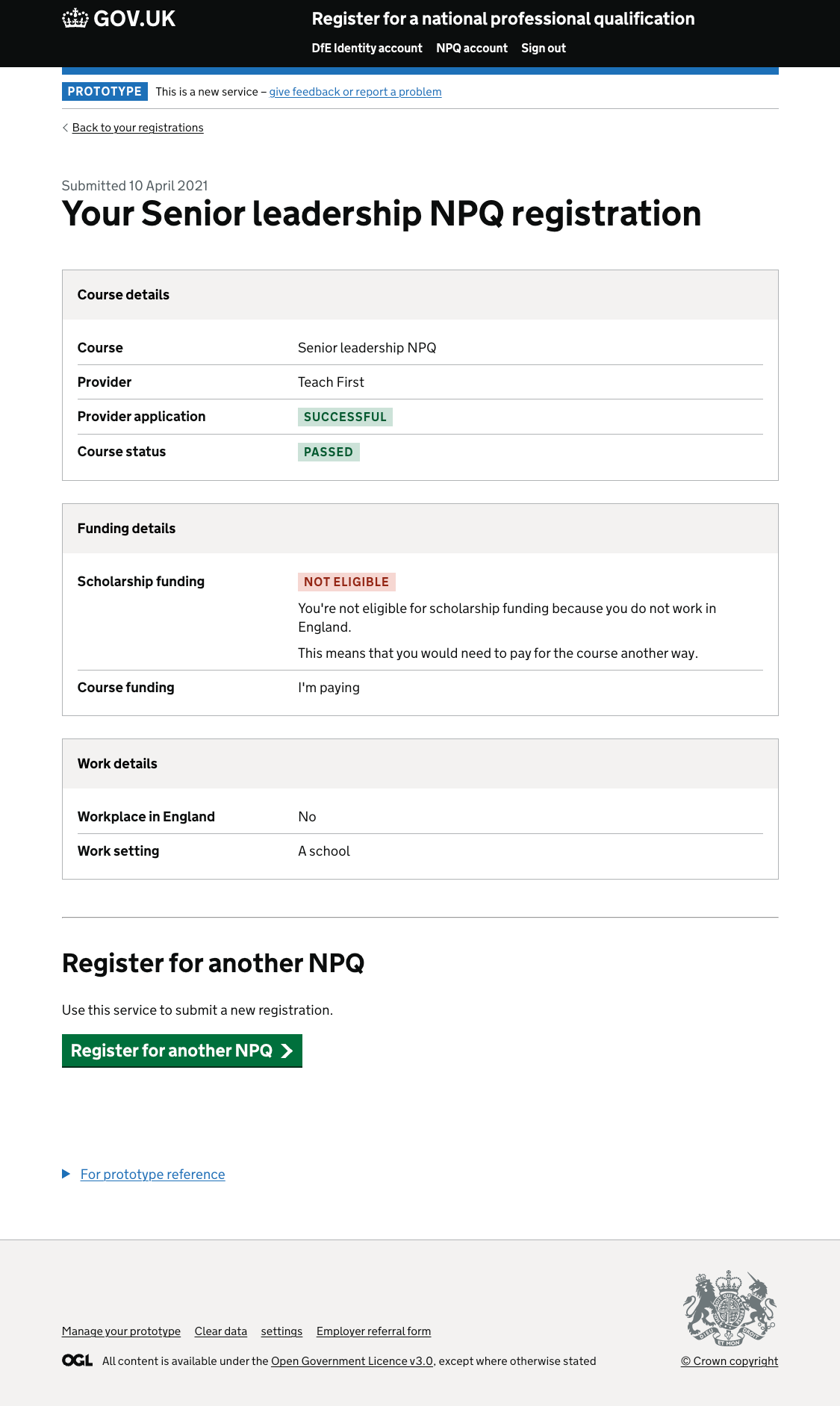
The registration details page (the landing page for users who have already registered for an NPQ) reflects the different possible funding statuses a user would see during the registration flow.
-
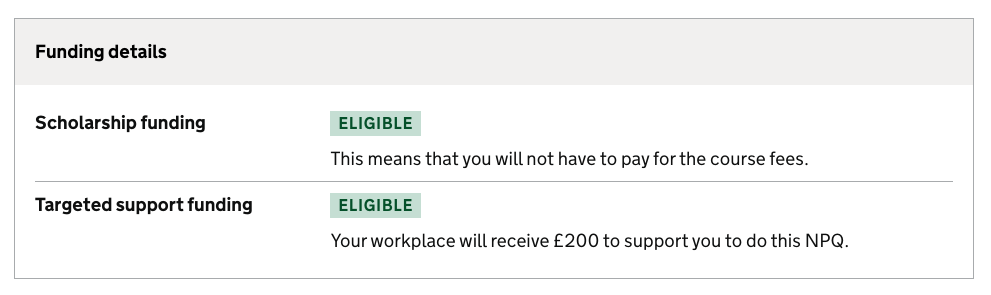
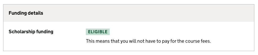
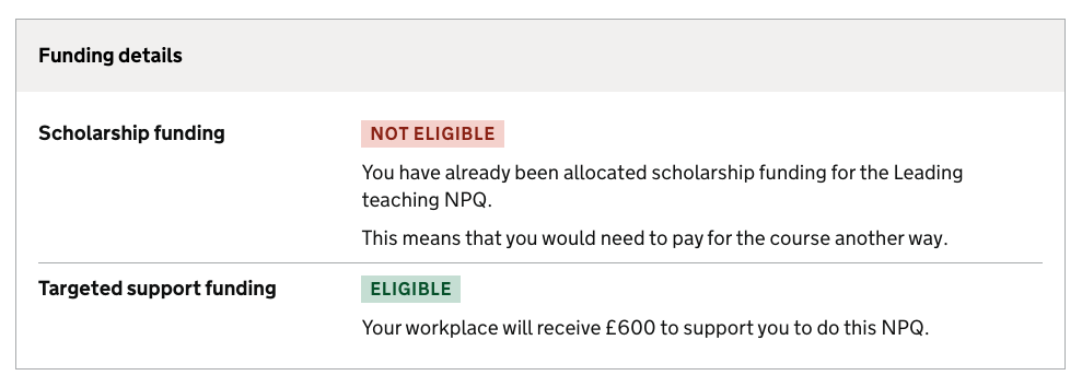
The status names have been updated to reflect the langauge used on the outcome pages during the registration flow. They are now:
- Eligible
- Not eligible
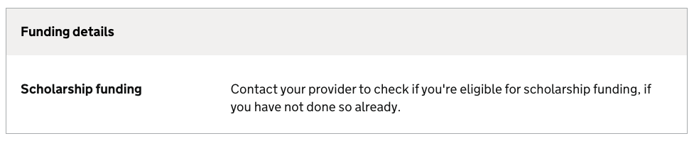
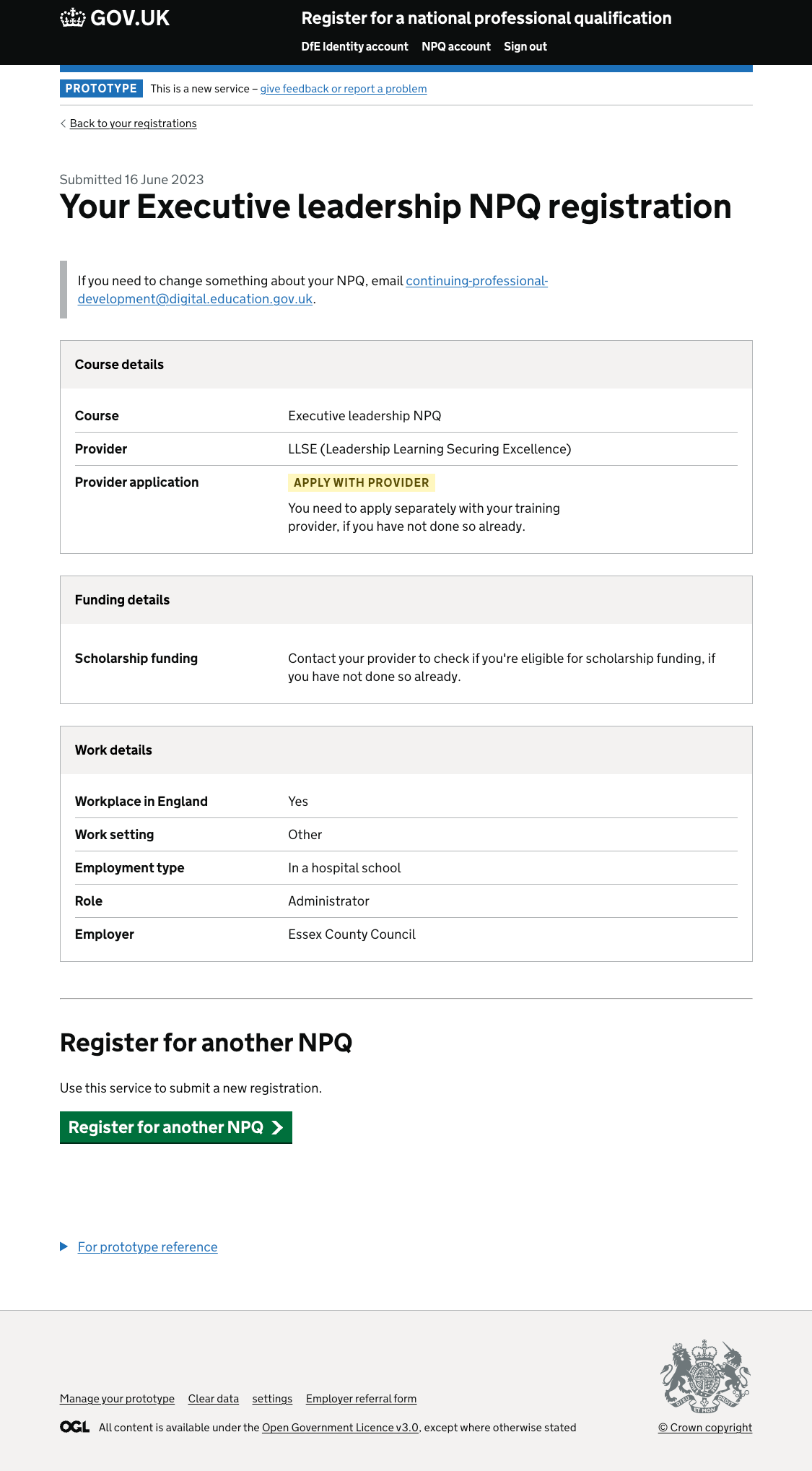
- For users whos eligibility is in review, there is content to tell them to contact their provider to find out the outcome.
-
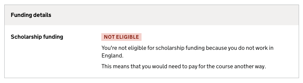
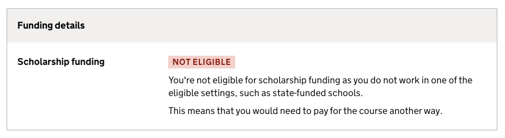
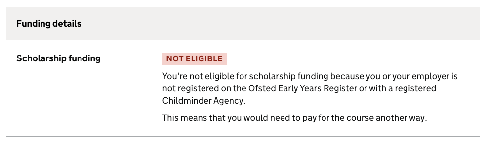
Additional text has been added below the status to explain what it means for them. For ‘Not eligible’ we also show the reason they are not eligible. This uses the same language as in the registration flow but a shorter version.
-
We only show the row for Targeted support funding if the user is eligible. This matches the registration flow. We believe users are not that aware of this funding and that it would be confusing to show this information if they are not receiving it.
See screenshots further down this page
2. Provider details
The problem
- Users had different interpretations of what ‘pending’ meant, as a status under ‘Provider application’.
- Users wanted to know what else needed to be done or if it was out of their hands.
Pending can mean a variety of things and was being used when we didn’t have a definite alternative status e.g. accepted or rejected. We are unable to get a status for every point on the journey e.g. application submitted. This leaves the status with too many potential options and unknowns and doesn’t give the user clarity on what to do next.
Pending = waiting for provider to do their bit, I think - though this needs to be clearer
Design changes
-
The ‘provider details’ table has been removed. As this information is directly tied to the course it made sense to be in the same table.
-
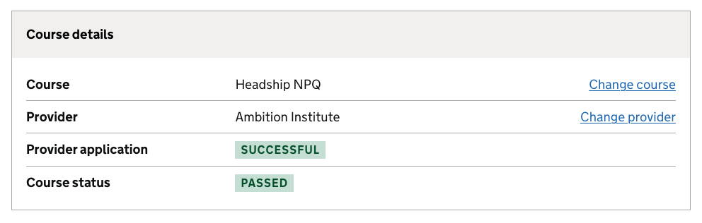
The status has been split into ‘Provider application’ and ‘Course status’ to give more clarity to users.
-
The statuses now have the following states:
- Provider application
- Apply with provider (yellow)
- Successful (green)
- Unsuccessful (red)
- Course status
- Passed (green)
- Not passed (red)
-
When the ‘provider application’ is ‘Apply with provider’, additional information is shown to remind users to apply with provider.
-
‘Course status’ is only shown when we have a value (this is after we receive an outcome declaration from the provider).
-
When there is no ‘course status’ an email address is provided at the top of the page for users to contact if they need to make changes.
-
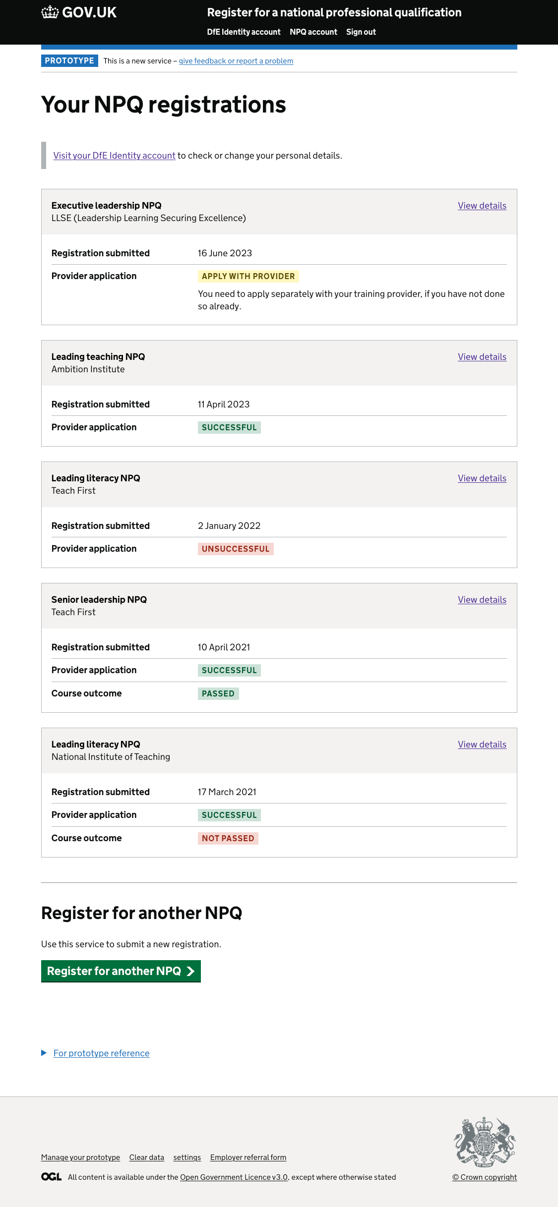
These statuses also show on the summary on multiple registration list view.
See screenshots further down this page
3. Making the multiple registrations page more consistent
The problem
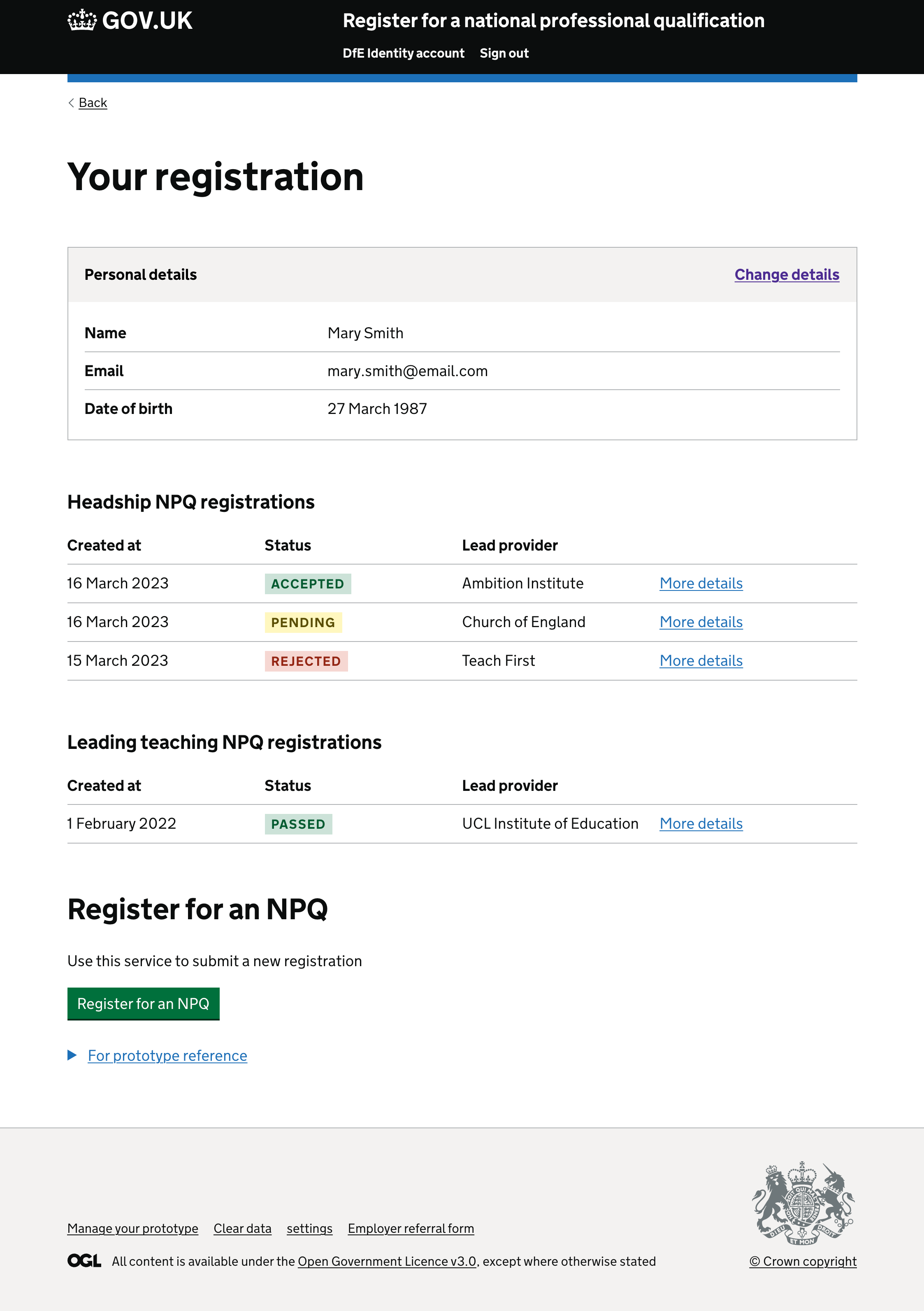
The course names were hard to find and the table format wasn’t consistent with other parts of the service, or other DfE services.
Given only 0.05% of users (32 people) have more than 4 registrations, and the most is 9, there was no need for a table format. Summary cards allow the content to be displayed in an easy to consume format.
Design changes
- Using summary cards for each registration instead of a table
- Including NPQ in the h1 to improve signposting
- Changing ‘created at’ label to ‘Registration submitted’
- Displaying the Provider application and Course statuses
See screenshots further down this page
4. Other design changes
- All the funding details have been moved to a separate summary card so it’s easier to find.
- The work details have moved to the last summary card shown. This is because it is the information the user is least likely to be reviewing when they return to their account. It also means the statuses move up the page and ‘apply with provider’ is visible when the page loads after completing a registration. This helps the user see the next action to take and that they haven’t completed their application.
- A link to the DfE Identity account is shown instead of displaying each personal detail. As all of these are edited in the account.
- The registration status has been removed as it would only ever have one status. A user cannot see this page unless it has been submitted.
- If a user has multiple registrations, and is viewing the details of one of the registrations:
- The course name has been added to the h1, for signposting
- A back link has been added so they can return to the list view.
- Information about who to contact to change details if you have already started the course has been moved next to the ‘started’ status instead of the top of the page.
See screenshots further down this page
Screenshots
1. Funding status
Before changes were made
Eligible for Scholarship and Targeted support funding
Eligible for Scholarship funding only
Eligible for Targeted support funding only
Not eligible for Scholarship funding as they don’t work in England
Not eligible for Scholarship funding as they don’t work an eligible setting
Not eligible for Scholarship funding as not registered with Ofsted
Eligibility in review
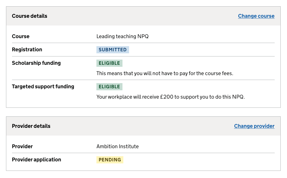
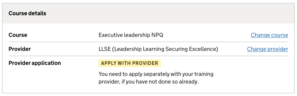
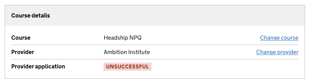
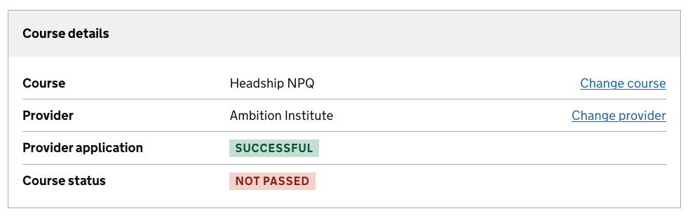
2. Provider details
Before
After
Apply with provider
Application unsuccessful
Application successful, course not passed
Application successful, course passed
3. Multiple registrations page
Before
After - showing all possible statuses
4. Other design changes
Before
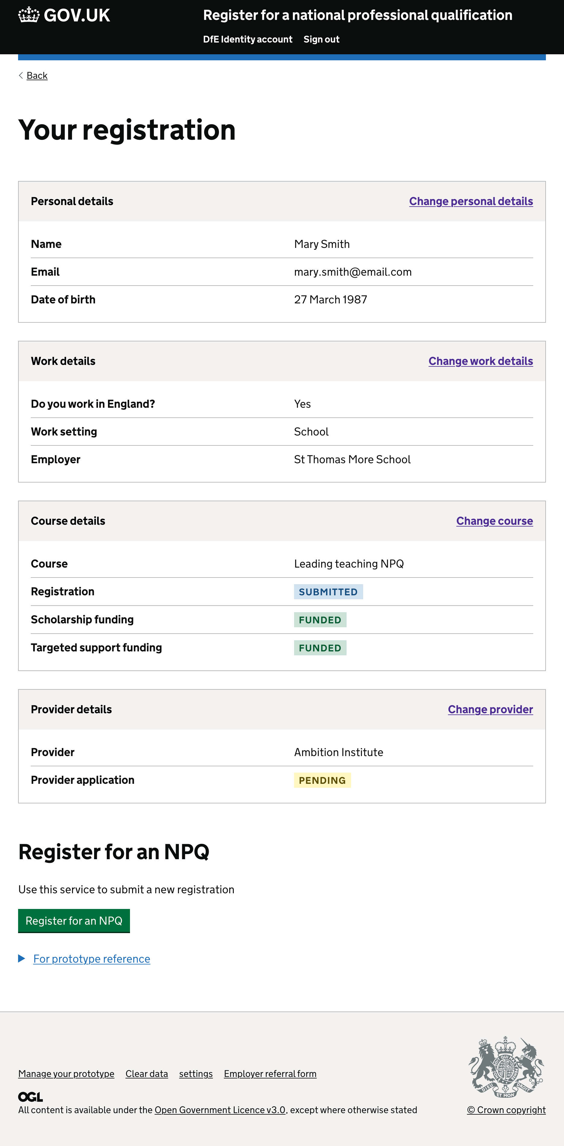
After - viewing details of registration, for a user with multiple registrations
After - single registration
