New landing page for lead providers
Background
The existing ‘Manage training for early career teachers’ service’s landing page for lead providers melds general programme guidance with technical information about integrating with the service’s API.
Evidence from research and from support queries shows that providers:
- struggle to find information
- don’t always know about updates
- need more clarity on certain processes or when things go wrong
The page has grown organically, which made maintenance harder and increased the risk of mismatches with the technical documentation.
Previous accessibility and usability audits have also highlighted inconsistent headings and limited wayfinding for keyboard and screen-reader users.
Goals
In 2026, the ‘Manage training for early career teachers’ service will be decommissioned and all guidance, release notes, and API entry points will move to ‘Register early career teachers’.
We’ve built a sandbox for providers to test integrations in the new model, and we’re using this pre-production period to create clearer, more concise information for lead providers to make sure we’ve covered everything they need.
We’ll do this by:
- making it easier to find the Swagger technical documentation, the sandbox environment, guidance and release notes
- reducing cognitive load with a simple landing page design and clear labels
- making Swagger the single source of truth for the technical specification
Main issues with the current landing page
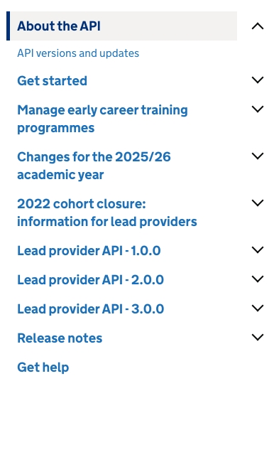
No clear content hierarchy
There are many links presented at the same level in the left-hand navigation with equal weight, so it’s hard to know where to start.
Technical and programme information not clearly separated
Providers might struggle to know when to read guidance vs technical reference material.
Release notes buried
Latest changes are not visible at a glance.
Duplication risk
Endpoint details sometimes repeated in guidance and technical documentation.
What we’ve done
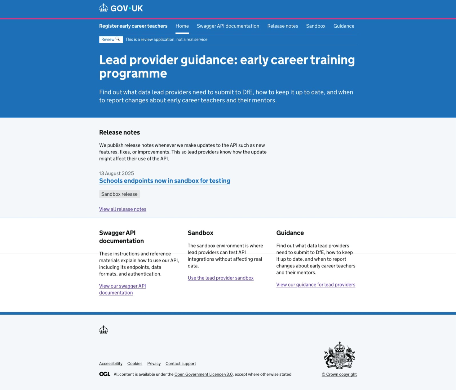
We’ve designed a new landing page for lead providers.
Primary calls to action
We’ve added primary navigation at the top of the landing page.
Task-based micro copy
“Use the sandbox…”, “View our Swagger…” instead of long topic lists.
Latest release note preview
We’ve placed this towards the top of the landing page, with a link to the full list.
Clear separation of information
We’ve used a grid design to split up content sections. This can be expanded if necessary, is responsive to work better on different devices, and allows us to include brief summaries describing what the content is about.
Accessibility considerations
We’ve added semantic landmarks for fast keyboard/screen-reader use, made secondary links descriptive with clear page titles, and written everything in plain English with short, scannable sections.
Next steps
Iterate labels and content hierarchy:
- get feedback from technical and operational users. Reorder content, and edit headings and tabs if necessary
- build out guidance information
- potentially investigate adding persona cues (developers vs operational staff) to steer users to the right route