Create a clear navigation structure for lead provider guidance
Background
Lead providers use our guidance for 2 very different jobs:
- Integrating with the API.
- Understanding responsibilities and process.
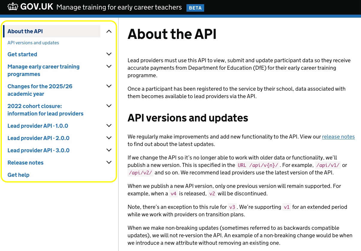
In the current ‘Manage training for early career teachers’ service, those needs are combined in a single left-hand navigation structure featuring long topic pages, versioned endpoint lists, and an archive of release notes.
Providers told us it was hard to know where to start, and support queries often revolved around questions like “Where do I find the spec?” or “Is this the latest guidance?”.
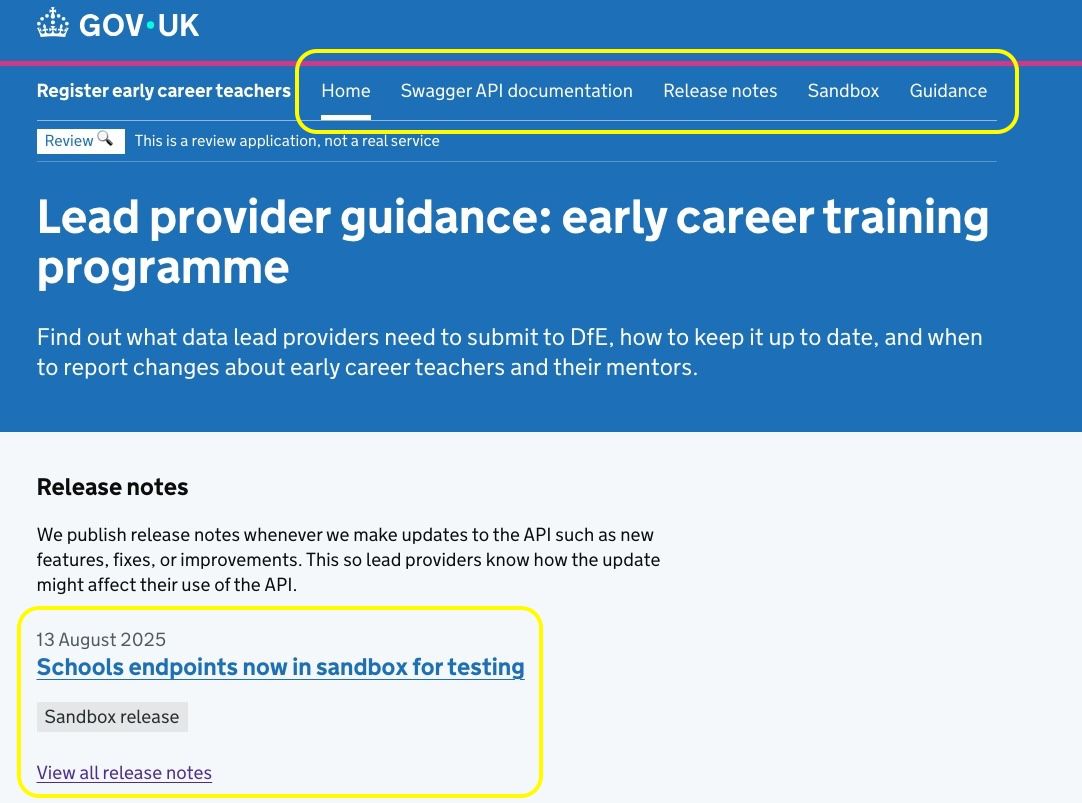
We’re retiring the ‘Manage training for early career teachers’ service and moving all guidance, release notes and API access to ‘Register early career teachers’ in 2026. This move gives us a chance to simplify the navigation, with one clear landing page clearly linking to the Swagger technical documentation, the development environments, operational guidance, and the latest API updates.
Goals
We set out to simplify the point of entry for lead providers and reduce cognitive load by:
- separating concepts (Guidance) from the technical documentation (Swagger)
- including a link to the development environments (only Sandbox for now) in the primary navigation
- surfacing the latest changes early (Release notes)
- using clear, task-based descriptive links
The navigation work focuses on wayfinding. Content rewrites and deeper information architecture changes are being handled separately.
Main issues with the current navigation
Problems we’ve found include:
- large, mixed table of contents with content hidden behind dropdowns make it difficult for users to find information
- no primary navigation at the top of the page
- providers have often told us they’re not sure whether to read guidance, scan release notes, or jump to the API technical documentation
- deep navigation increases the risk of landing on out-of-date examples when schemas change
 .
.
What we’ve changed
| Area | Existing guidance | New design | Impact on users |
|---|---|---|---|
| Entry point | Single hub with many links (versions, topics, long pages, release notes) | Four primary calls to action in the primary navigation | One or 2 clicks to find what they need |
| Reference navigation | In-site endpoint lists (v1 to v3) alongside guidance | Defer endpoint navigation to “Swagger” as the single source of truth | Less duplication. Fewer mismatches between guidance and schemas |
| Conceptual vs technical documentation | Conceptual guidance and examples mixed with reference | Separate pathways: “Guidance” (concepts/how-to) vs “Swagger” (tech docs) | Clear mental model. Easier for non-technical readers to find explanations |
| Change awareness | Long archive of release notes buried in navigation | Latest release note previewed on the landing with link to full list | Users notice changes earlier |
| Support links | Compliance links in footer | Prominent “Accessibility”, “Cookies”, “Privacy”, “Contact support” links | Clearer routes to help and mandatory information |
 .
.
Primary navigation flows we’re optimising
Technical users:
- Landing page to Swagger.
- Browse endpoints.
- Copy schema examples.
- Access Sandbox.
Operational users:
- Landing page to Guidance (concepts, responsibilities, how‑to information).
- Check release notes when processes change.
Accessibility considerations
We’ve included:
- consistent main navigation and clear page titles
- semantic landmarks for keyboard and screen‑readers
- destination‑focused link text (no “click here”)
Next steps
Improve labels and paths:
- test link labels (“Swagger API documentation”, “Guidance”, etc.) with technical and operational users
- iterate link order based on analytics (put the most-used first)
Accessibility checks:
- audit semantic landmarks (
header,nav,main,footer) so keyboard and screen-reader navigation is consistent